
 Responsive web design, first and foremost, is a huge facilitator of content consumption for the reader. Secondly, it benefits your search engine optimization (SEO). With their latest handful of updates, Google has all but guaranteed that websites which cater to the human reader will see improved search ranking in the SERPs (search engine results pages).
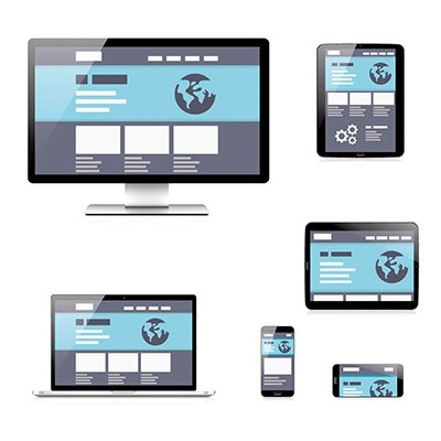
What, exactly, is responsive web design? At its core, it is when your website has a template that can shift to perfectly fit whatever screen it is being viewed on. For example, you want your traffic to be able to see all the menus and advertisements on your website, whether they are viewing the site from a desktop or the much smaller screen of a mobile device.
Furthermore, Google has strongly hinted that sites which incorporate responsiveness into their web design will receive better rankings overall. This makes sense from a speed and optimization perspective: sites where the code efficiently resizes the screen will perform better and fast, which means fewer users will exit your site in favor of another because of slow load times and poor readability.
The Importance of Web Design for SEO
As a result, responsive web design is an absolute must if you want to take advantage of your current traffic, as well provide your site with the toolsThe fact is, as better and better mobile devices hit the market, the public is responding by using them more – even over the desktop or laptop computer. Countless searches are conducting every day from smartphones, which means that if your website prioritizes mobile responsive design, you could have a leg up on the competition.
to further grow that traffic. This is especially true if you have a social media presence; a page that renders graphics better will simply be used more by people who frequent Facebook, LinkedIn, Twitter and the other social networking giants.
Always remember: the entire point of SEO is to deliver the best content to users. As such, Google prioritizes any metric that has shown the ability to deliver the kind of content that people respond to; since more than twice as many people use mobile devices as they do desktops (as of 2016),
Google’s algorithm has responded to this by elevating the importance of mobile search into its equation.
This clear preference for mobile optimization has led to a handful of clear-cut options that any website designer can take into consideration to give their webpage a boost in search rankings. Primarily, it gives you the direct benefits of mobile responsiveness.
1. Enhanced Site Experience
It is a well-known fact that business websites that are difficult to navigate have high user-turnover rates. Basically, if your incoming traffic cannot find something easily, they simply leave your site and conduct another search. The hassle is not worth it.
This is one of the reasons why responsive web design is so essential to not only capturing your traffic but also to making sure they stay to check it out – and possibly convert. This could mean buying something, leaving their contact details, or sharing your web post. Make sure your site renders properly for every mobile device out there, and you will be well on your way to maximizing your reach.
2. Web Pages That Load Quickly Rank Well
It is a well-known fact that faster web site loading times leads to a positive user experience. As such, Google has incorporated this as a ranking factor in its algorithm; you simply cannot get the best ranking that the rest of your SEO entails, without having a page that loads quickly. The search engines will reward you for it.
3. Increased Sharing on Social Networks
This has obvious utility. More people access their social networks while on the go (read: via mobile) than ever before. If you have a website that is geared toward ease-of-mobile consumption, then you are ahead of the game when compared to other companies in your industry.
Social shares are not strongly correlated with SEO, but they help you out directly. Social media is, after all, the second largest source of traffic around, and some experts think it will even surpass search in the near future.
4. Higher Google Ranking
User-friendly: this is one of the main characteristics of a 100% responsive web design. A site that provides the best user experience to its visitors certainly gets to the first page of SERPs. Building a website that is 100% responsive in all devices might be difficult especially for those who haven’t got any experience with web development. But if you are serious about getting your brand on top of search engine pages, most specifically Google, then you will have to invest in employing the best web development team with the best people that can significantly impact your Google ranking.
5. Improve sales and increase conversion
Websites that are responsive in both wide- and narrow-screen devices provide great experience to online visitors which can convert to long-term, loyal customers. Giving your online visitors the information and visuals they need without the having to constantly pinch and zoom images or texts on your site definitely gives off a good impression. Trust experts when they “Happy site visitors are satisfied customers.”
Incorporating a Responsive Web Design Into Your Site
Generally, if you already have a website that is up and running, it is best to consult a web designer well-versed in behind-the-scene programming. The web designer will need to go into your HTML, CSS, Javascript, pHp or whatever language you have used to render your site, in order to alter it and add mobile capability. As there are a lot of different screen sizes for tablets and smartphones, the code will need to be able to resize your site for each one for best traffic results.
Alternatively, you can also have a web designer build a separate set of code lines; this means that when your site detects access via mobile, it serves up the second line of code to fit the screen. This method is more about addition than alteration; when being viewed on a desktop or laptop computer, the original line of code is served up.
A 100% responsive web design can:
- Adjust the layout of webpage according to the device’s resolution the visitor is using
- Adapt the size of images automatically so they on the screen of the device without pinching or zooming in, specially when viewed on a mobile device
- Make the features of the site more simplified for visitors who do not have the luxury of time to navigate everything on the site
- Conceal or eliminate inessential features of the site when viewed on smaller devices
- Resize CTA buttons and navigation links to any touchscreen device where the user’s finger serves as the mouse pointer
- Automatically change the device orientation, either horizontal or vertical, to provide greater user experience.
- Intelligently use mobile resources such as geolocation
If all these technicalities sound complicated and confusing to you, you do not have to worry. A team of professional web designers can handle the confusing and complicated part for you.
A Web Design and SEO Team of Experts You Can Trust
As you may have finally realized, a 100% responsive web design is highly relevant, to the point that it can significantly affect the relevance of your SEO efforts to SERPs. It is time to get a leg up on the competition by using general SEO and elements of web design. Authority Solutions™ has just this team of experts, where our collective decades of experience helping customers rank #1 in Google can help you realize your vision of success. Let us help you approach the 100% Responsive Web Design that is so essential to ranking well in Google Search today – you can reach Authority Solutions™ here.


