
 The importance of mobile design in the current era of SEO cannot be understated. More people than ever are accessing websites using their smartphones and tablets, which means that if your website does not render correctly and serve up a viable user interface, then you are missing out on potential traffic.
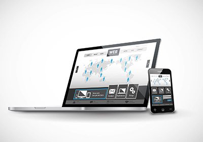
The primary alteration your site needs is a responsive design. By having your landing page change to fit the screen size in question, you make the site much more navigable and attractive to incoming viewers. This improves your bounce rates, click-through rates and time-on-page. All of these factors are very important in ranking in Google Search, which should be a priority for any business looking to increase profitability.
In the following, you will learn about the distinct benefits of responsive mobile web design for your business site, what steps to take to make sure it is implemented properly. Mobile, by all accounts, is the frontier of the future, as Google and other tech companies further hone their sights on this lucrative and growing field.
The Distinct Benefits of Mobile Web Design
The most obvious benefit that mobile design has is the traffic. With so many people conducting web searches from their phones, you are missing out on loads of visitors if your site is not optimized for smaller screens. With that said, let us delve right into the distinct benefits:
1. Your Pages Will Load Faster with Responsive Design
This is an observed and measured fact. So, in addition to people not becoming frustrated with the slow loading times of non-responsive websites, Google has actually included page speed as a ranking factor. Your SEO will suffer, basically, if your website performs more slowly on a mobile device than it does on a workstation.
Just think of Google’s ranking factors as geared towards the experience of the user, and it will be easy to understand why page load times are so important. If a user lands on a page from the search results, but leaves quickly because of a poor experience, then that site has to be degraded in the search results if the search results pages are to be an accurate metric of rank by site performance.
2. Benefits in the World of Social Media
As a business owner, you are probably aware of the great utility of social media in your promotional endeavors. Responsive mobile design, similarly, plays a big role here, too; most people interact with their social media platforms via mobile. If your site renders favorable in this medium, then chances are you will receive more social shares than you would on a desktop computer.
It is important to realize that social does not directly affect Google Search rank (not much, anyway); however, social is a powerful enough medium by itself to drive significant traffic to your site.
3. Your Site Is Easier to Navigate
We have hinted at this before; if your website is not easily navigable, then you can bet your last dollar that people will click away from it in favor of another website, or to conduct another keyword search. Ease-of-use is paramount, and this is where the greatest strength of responsive mobile device shines.
You want to provide the best user experience possible, ultimately. In addition to having a direct benefit to your website, this ease-of-navigation metric is counted positively in the Search algorithm. You will notice an increase in your ranking, basically, shortly after you incorporate mobile web design in your marketing strategy.
4. Improved Bounce Rate
If you are logged into Google Analytics and use it frequently, then you are likely aware of the bounce rate metric. Generally, the lower you can get this value, the better. Bounce rate measures the time-on-page, essentially; are your visitors leaving soon after landing, or do they spend awhile there, and then, even better, navigate to other pages on your website?
This, in totality, is referred to as user behavior, and Google uses it as a ranking factor. Obviously, if they spend a lot of time on your page relative to similar content across the web, then your site receives more credit in Search. If they leave quickly, this could be due to a number of factors; but Google regards it as a poor user experience (broadly). In this regard, then, design is just as important as the actual on-page content, and it is clear why mobile responsiveness should rate highly.
5. The Importance of Unique Content
Google does not want the same material on different domains throughout the web. If you have code to render a second mobile site in addition to your desktop site, this could signal duplicate content to Google. As a result, it is much better to have a single domain instead of a second mobile domain. Responsive mobile design takes care of this easily, without incurring any duplicate content penalties.
A 100% mobile responsive design can:
- Increase your reach to online audience and potential customers who are using smaller devices (smartphones)
- Provide consistent user experience that can multiply sales and conversions and improve lead generation
- Consolidate tracking, reporting and analytics in one place
- Decrease the time and cost spent on management of site content
- Lead your business to the top and help you stay ahead of the competition (there are still other businesses and companies in your industry that have not implemented a mobile-ready site until today!)
Netizens and millennials have become very dependent on their smartphones specifically when searching for something that they urgently need. Aside from being portable, most people prefer their smartphones for they have continuously evolved and provide features that make their lives easier. That is what the contemporary generation want: quick, spoon-fed information.
A desktop-optimized site with a shrunken version when viewed on a smartphone will not likely provide optimal experience to your mobile audience, which will result in less visitor or, worst, zero sales and conversion. With a 100% mobile responsive site, you can provide your visitors with the following features:
✓ readable content and clear images without requiring to zoom in
✓ Tap targets that are sized appropriately
✓ Horizontal scrolling is disabled
To materialize your SEO goals, you must do what Google says, and Google recommends a responsive web design for a mobile-optimized site. You can never go wrong with a mobile responsive site. You must provide your online clients and potential customers easy and smooth access when exploring your website’s information using their smartphone. Investing in a mobile responsive web design and employing professional that offers web design templates and services will help you stay ahead of the trend. Reach your target audience by providing them an exceptional experience when viewing the products and services you offer.
Hiring professional web designers will help you skip all the humps and bumps. Make your site No. 1 in mobile search ranking in SERPs and become an authority in your industry. To succeed, you need more than just good website templates; you need the expertise of an SEO team that delivers solutions and results!
Mobile Web Design Optimization by Experts
The bottom line is that you want mobile users to have the same full range of functionality as desktop users possess when viewing your website from their phones. To this end, the web design and SEO experts at Authority Solutions™ are here to help build mobile responsive website design that will shoot you to the top of Google Search for your chosen keywords. This, in tandem with creating a 100% responsive mobile web design, will have more qualified visitors than ever before seeing your landing pages and interacting with your site. Call us today at 888-997-4146 or reach us at Authority Solutions™ for more information on beating out the competition.


