With our effective and reliable digital marketing strategies, you can get ahead of your competition and attract more traffic, leads, and sales.


At Authority Solutions®, we blend creativity and technology to provide effective digital marketing services. Our SEO strategies enhance search rankings, driving traffic ready to engage with your business, while our website designs balance functionality and style, prioritizing user experience. Additionally, our content marketing highlights your brand and builds meaningful connections with your audience. As a leading internet marketing agency, we develop comprehensive strategies that help businesses expand their digital footprint and achieve long-term success.
Our services include social media strategies that enhance your online presence and email campaigns that build customer relationships. From web development to SEO, every solution is customized to align with your goals, ensuring a cohesive plan designed for success. With our expertise as an experienced internet marketing company, we ensure each campaign is data-driven and results-focused.


Our SEO experts develop and implement strategies that boost your site’s visibility in the places that matter most, ensuring your target audience can find you quickly and efficiently while increasing relevant traffic to your site. By incorporating tailored internet marketing solutions, we optimize every aspect of your SEO strategy to drive sustainable growth.
Your website serves as the digital face of your business, so we create fast, visually appealing, and highly functional websites designed to offer a seamless user experience and turn casual visitors into loyal customers. As a trusted digital marketing company, we build websites that are visually stunning and designed to support your marketing efforts.
We analyze your data and transform it into actionable insights, providing detailed reports that empower you to make well-informed decisions while keeping your marketing efforts focused and aligned with your business goals. With our deep understanding of internet marketing solutions, we track key performance indicators and refine strategies to enhance your ROI.
At Authority Solutions®, success is more than a goal. It is a measurable outcome backed by data. Our dedication to producing real results has helped clients grow their businesses, attract new customers, and secure valuable leads that support ongoing growth and profitability.
Witness an exceptional average increase of 54% in website traffic within the first half-year, marking a significant leap in audience engagement and business opportunities.
Experience a remarkable 37% rise in conversion rates as we fine-tune your user experience and call-to-action strategies, transforming interest into tangible results.
Revel in an average ROI boost of 120%, a testament to the efficiency and impact of our strategic marketing investments tailored to your business objectives.
Ascend to new heights with a stellar 92% client satisfaction score, reflecting our commitment to meet and exceed client expectations.
We aim to transform these challenges into triumphs with custom strategies honed for your marketing needs. Let us guide you through the complexities of digital marketing, ensuring that your brand competes and thrives in this digital era as your dedicated agency partner.
Standing out in a crowded marketplace is challenging, especially when customers are overwhelmed with choices. At Authority Solutions®, we focus on strategies that enhance your brand's visibility using SEO and content marketing. By emphasizing what makes your business unique, we help create an authentic connection with your audience.
We create campaigns designed to make your brand not just seen but remembered. Whether through targeted keywords or impactful content, we position your business to resonate with the right people at the right time.
Attracting visitors to your website is just the first step. Turning those visitors into loyal clients is where real success lies. Many businesses need help with this transition due to unclear messaging or a disjointed user experience. Our team analyzes your website’s data to identify the gaps holding potential customers back.
From there, we make strategic adjustments that enhance the customer journey. We create an experience that encourages visitors to engage, trust, and return by streamlining navigation, refining calls to action, and optimizing key touchpoints.
A marketing budget without focus can quickly be drained on tactics that fail to deliver. We believe in making every dollar count by analyzing how your resources are currently being used. Our team identifies underperforming areas and redirects spending toward strategies that show measurable impact.
This data-driven approach ensures that your investment drives meaningful outcomes, whether it’s attracting more leads or fostering long-term growth. With our expertise, you can confidently allocate resources to what truly works.
When your brand’s growth slows, it’s easy to feel stuck. We specialize in breathing life into stagnant brands by creating campaigns that refresh their image and target new markets. These campaigns are tailored to your goals, ensuring every effort aligns with your vision for the future.
By incorporating up-to-date SEO practices, engaging content, and social media outreach, we reignite excitement around your brand. The result is renewed momentum and the ability to stand out in an ever-changing market.
Understanding digital marketing can often feel overwhelming. Frequent updates, shifting trends, and changing algorithms can make it hard for business owners to know where to begin. That’s where we step in. Our team handles everything, from developing campaigns to keeping up with platform changes, so you don’t have to worry about the details.
We explain what works and why clearly, keeping you informed without overloading you with technical jargon. With our support, you can dedicate your energy to growing your business while we handle the complexities of digital marketing.
Authority Solutions® is dedicated to helping businesses thrive online with SEO services and web solutions that address your biggest challenges. By leveraging proven strategies, we boost your brand’s visibility, attract your ideal audience, and deliver measurable outcomes that drive growth. As an established internet marketing agency, we provide expert guidance and customized strategies to help businesses navigate the complexities of online marketing.
We simplify digital marketing by using data-driven decisions and creative approaches to connect with your audience. From improving search rankings to enhancing engagement and creating user-friendly websites, we focus on what matters most to your success and helping you achieve your goals effectively and efficiently.

With proven results and extensive expertise, Authority Solutions® sets the standard for digital marketing excellence. Our strategies in SEO, targeted campaigns, and customized solutions are designed to meet your goals. Partner with us to achieve meaningful outcomes and grow your business online.
Hear directly from our clients about the impact of our work on their success. Their stories reflect our commitment to excellence in digital marketing.


Our expertise spans diverse sectors, each with its unique digital landscape. We tailor our strategies to meet your industry's specific challenges and opportunities.
Delivering exceptional digital marketing solutions starts with a meticulous, step-by-step process. At Authority Solutions®, we ensure every stage of our strategy is purposeful and impactful, guiding your business to new heights of digital success.
Diving deep into your brand's core, we identify unique strengths and areas for growth, setting the stage for a tailored marketing plan.


Crafting a detailed roadmap, we establish clear goals to navigate the complexities of the digital landscape effectively.
Our team meticulously implements the plan, using cutting-edge tools and techniques to bring your marketing strategy to life.


Before launch, we meticulously refine our tactics based on analytics to guarantee peak campaign performance.
We launch your optimized marketing campaign with precision, making an immediate and impactful entrance into the market.

Discover the stories behind our successful partnerships. These case studies showcase the tangible results we've achieved for clients across various industries.

Explore how our targeted strategies have filled the gaps in the digital presence of grouting industry leaders, solidifying their market position and foundation for growth.
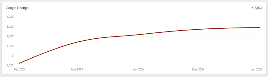
POSITION INCREASE IN SEARCH RANKINGS
Discover our delectable marketing campaigns, which have seasoned restaurants' digital presences, creating a blend of success and enhanced customer engagement.
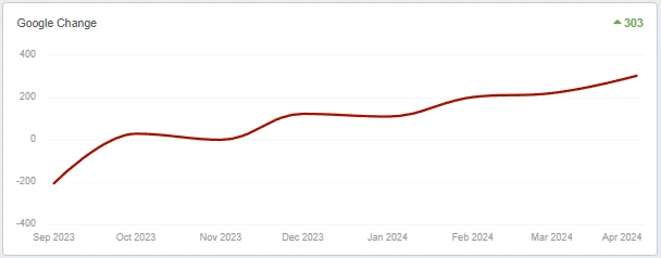
INCREASE IN CALL VOLUME
POSITION INCREASE IN SEARCH RANKINGS
Review our case studies where strategic legal marketing campaigns have won the case in the court of public opinion, elevating law firms to new levels of online authority.
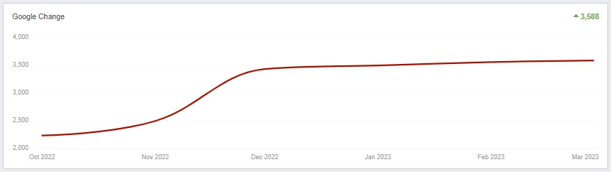
POSITION INCREASE IN SEARCH RANKINGS
See how our health-focused marketing strategies have improved patient engagement and practice growth, prescribing a digital transformation with lasting benefits.
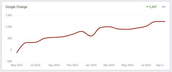
POSITION INCREASE IN SEARCH RANKINGS
With a history of success, our team provides reliable expertise in digital marketing, ensuring that every strategy is built on knowledge and experience.
Our focus is on building strong, long-term relationships. We work closely with you to achieve mutual success and shared goals.
Our SEO strategies focus on more than rankings, delivering measurable results that drive growth and improve your online presence.
Work With Us
Elevate your website to the top of search engine results, and watch your traffic and leads grow. Connect with us to harness the power of advanced SEO strategies tailored to your success.
Explore our insights on the pulse of digital marketing and discover how Authority Solutions® delivers SEO strategies with precision and integrity to drive client success.
Authority Solutions® | A leading digital marketing agency that offers Internet marketing services while bringing integrity to the industry.
Copyright © 2024 | Authority Solutions® | Privacy Policy | Terms of Use | Search Engine Optimization by Authority Solutions®
Status: {{status_text}}<\/p>\n\n\n{{#each objects}}\n\n \n\n
{{{description}}}<\/p>\n
{{location.address.formatted}}<\/em><\/p>\n\n \n {{#each images}}\n \n \n This is the demo content of the DB Object Popover<\/strong>.<\/p>\n How to edit it: if you are in mapsvg control panel now, click on the following link to open the template editor for this view: Menu > Templates > DB Object Popover<\/a>.<\/p>\n More information about templates: mapsvg.com\/docs\/map-editor\/templates<\/a><\/p>\n<\/div>\n {{{description}}}<\/p>\n {{location.address.formatted}}<\/em><\/p>\n\n\n{{#each images}}\n \n \n Regions: \n {{#each regions}}\n \n {{#if title}}\n {{title}}\n {{else}}\n {{id}}\n {{\/if}}{{#unless @last}}, {{\/unless}}\n {{\/each}}\n<\/p>","tooltipRegion":"\n{{id}} - {{title}}","tooltipMarker":"\n{{title}}","directoryItem":"\n\n{{title}}","directoryCategoryItem":"\n{{label}}<\/span>\n{{counter}}<\/span>\n<\/span>","detailsView":" This is the demo content of the DB Object Details View<\/strong>.<\/p>\n How to edit it: if you are in mapsvg control panel now, click on the following link to open the template editor for this view: Menu > Templates > DB Object Details View<\/a>.<\/p>\n More information about templates: mapsvg.com\/docs\/map-editor\/templates<\/a><\/p>\n<\/div>\n {{{description}}}<\/p>\n {{location.address.formatted}}<\/em><\/p>\n\n\n{{#each images}}\n \n \n Regions: \n {{#each regions}}\n \n {{#if title}}\n {{title}}\n {{else}}\n {{id}}\n {{\/if}}{{#unless @last}}, {{\/unless}}\n {{\/each}}\n<\/p>","detailsViewRegion":" This is the demo content of the Region Details View<\/strong>.<\/p>\n How to edit it: if you are in mapsvg control panel now, click on the following link to open the template editor for this view: Menu > Templates > Region Details View<\/a>.<\/p>\n \n {{\/each}}\n\n{{\/each}}","popoverMarker":"
\n\n\n{{title}}<\/h5>\n\n
\n{{\/each}}\n\n\n
\n\n\n{{title}}<\/h5>\n\n
\n{{\/each}}\n\n\n